Growers Sparkling Water
Client: Growers
Project Brief:
Growers approached me seeking a bold and vibrant design refresh for their line of sparkling water. They wanted a look that not only captured the uniqueness of their fruit blends but also maintained a uniform and recognizable identity across all products. The challenge was to create a cohesive visual language that would stand out on the shelves while emphasizing the natural and refreshing qualities of the drinks.
Design Concept:
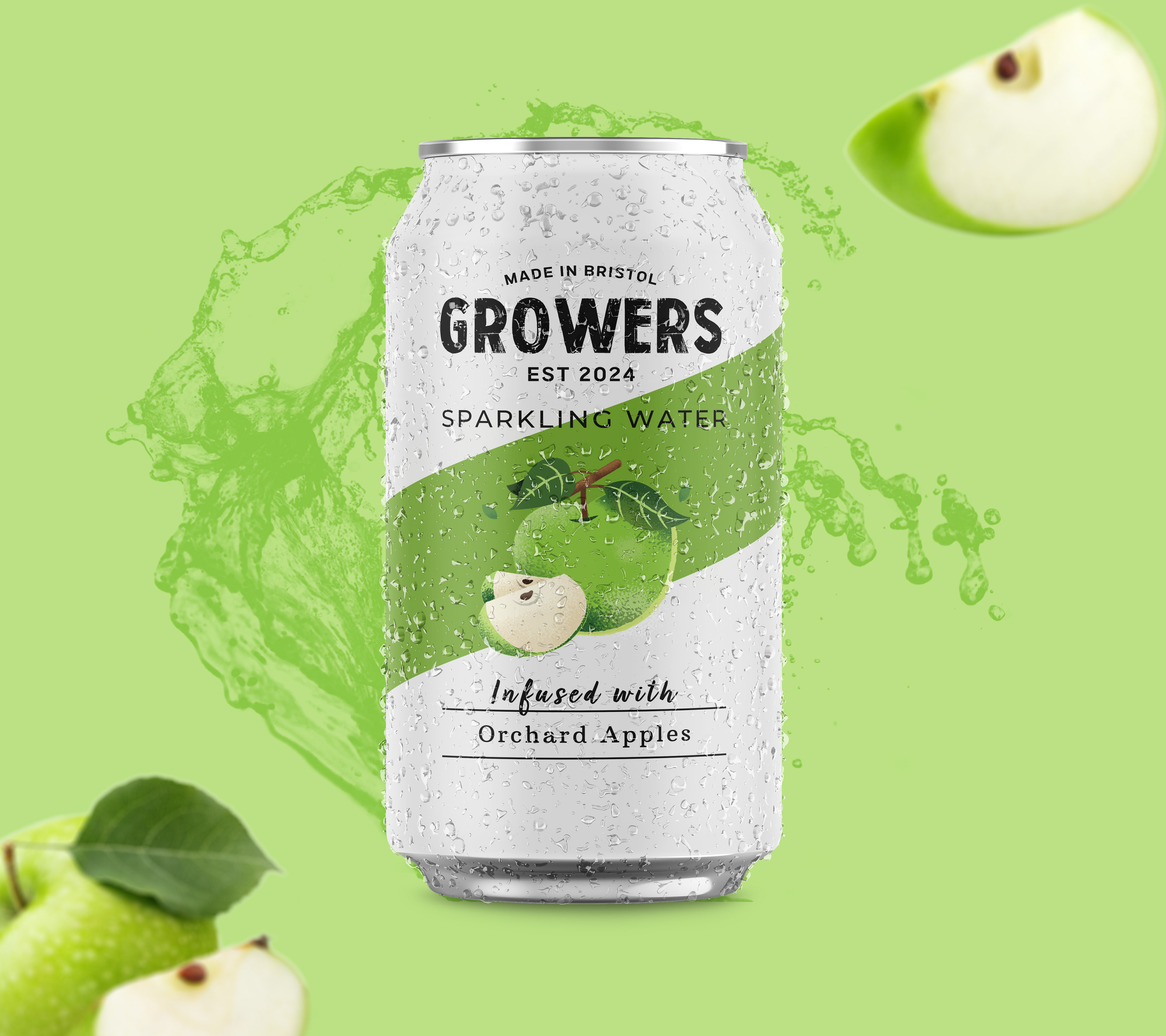
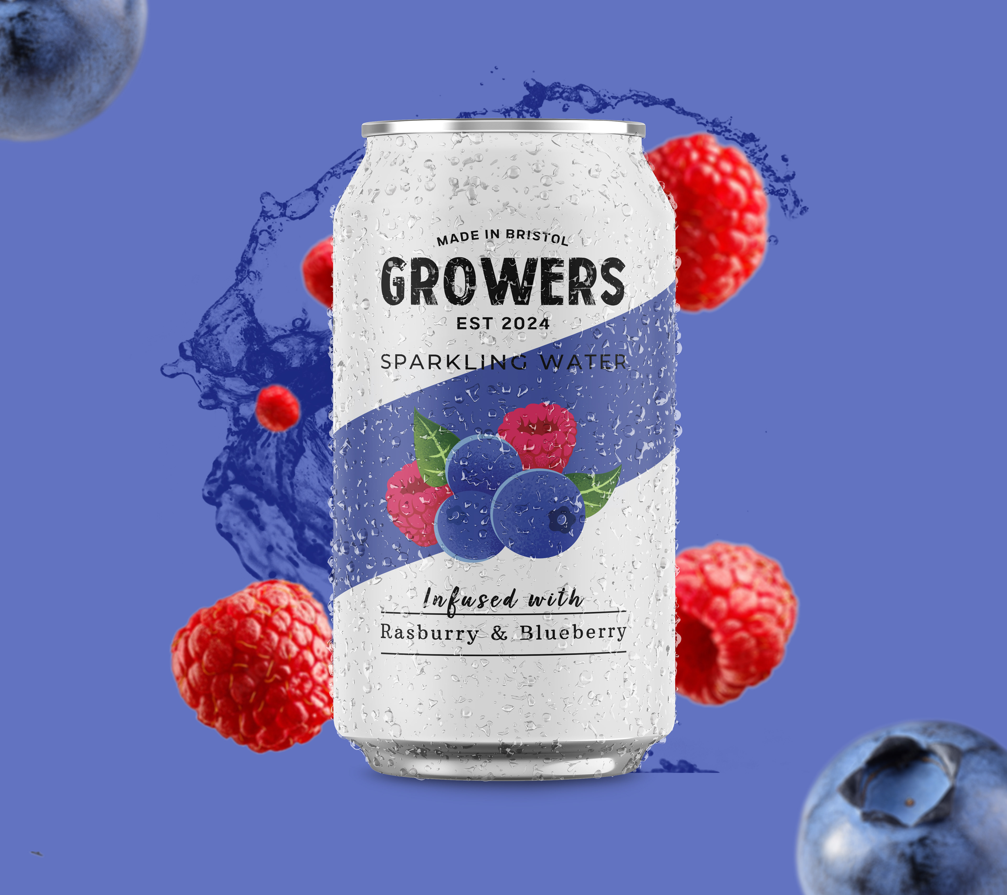
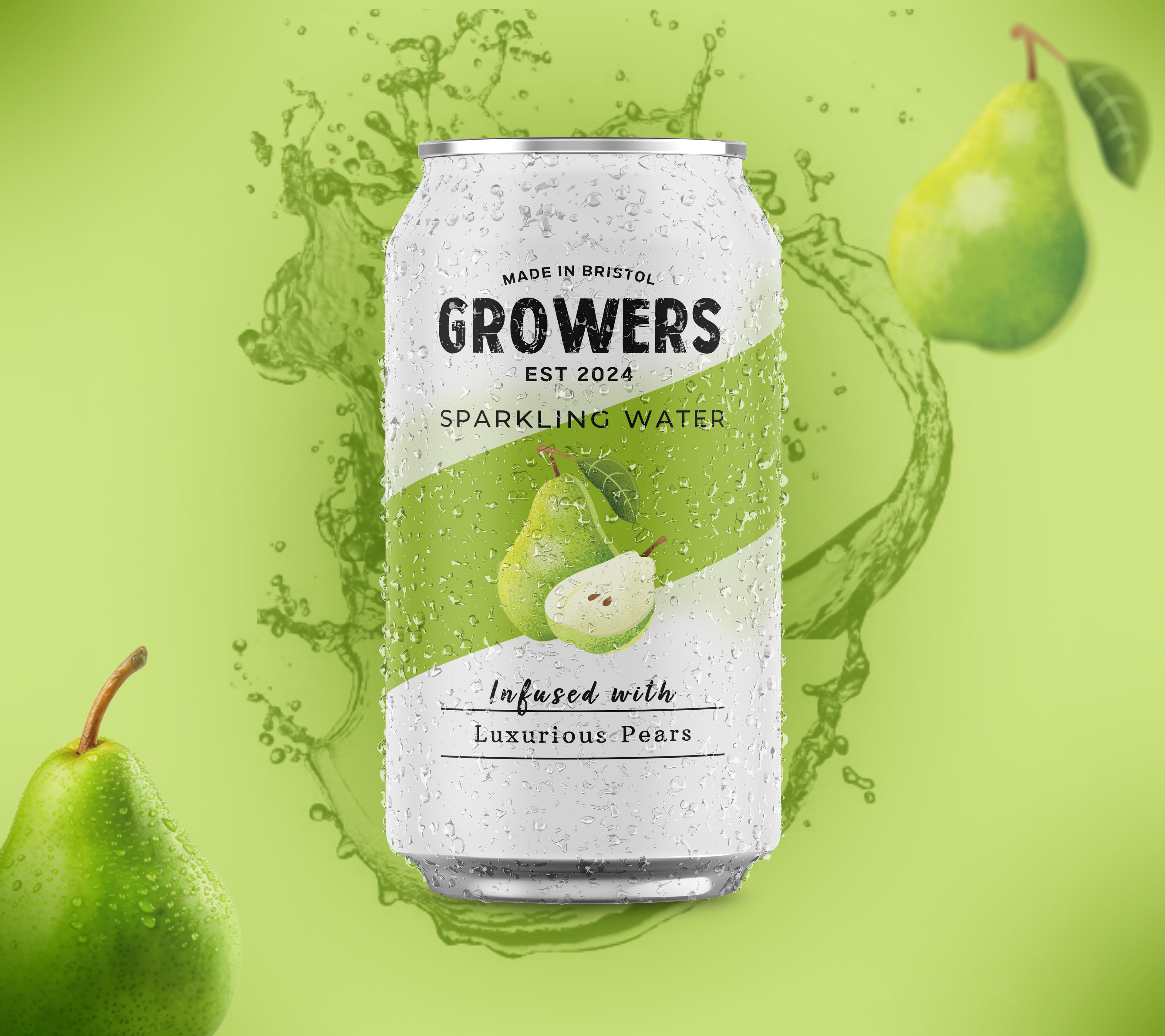
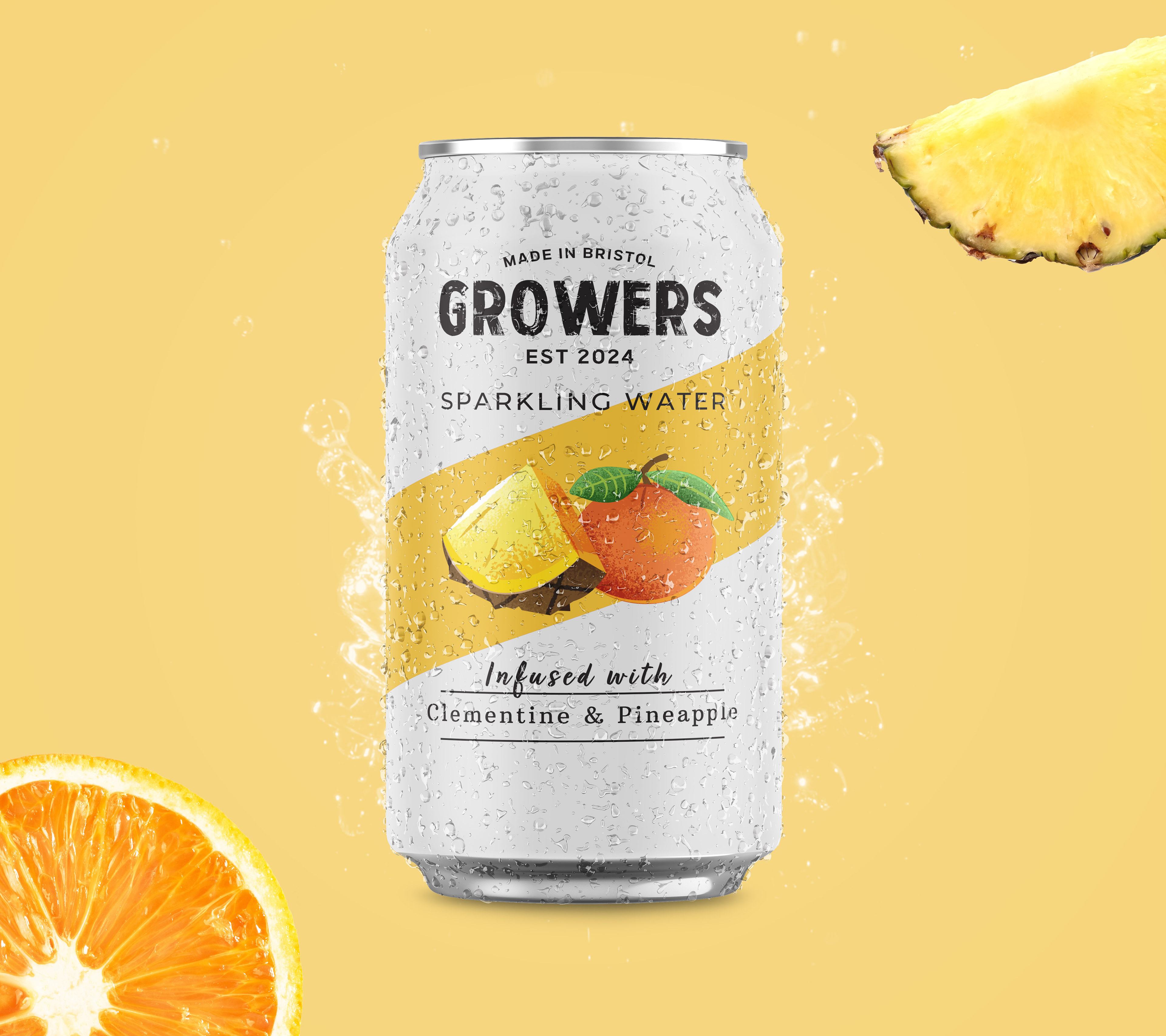
The design concept focused on using vibrant fruit tones and a clean, modern layout. Each can features a distinct color palette that represents the specific fruit blend, ensuring that each flavor is immediately recognizable.
Color Palette: Bold, saturated colors reflective of the fruits used in each blend were selected to create a striking visual impact. The background for each can was kept minimal and clean, allowing the fruit illustrations to take center stage.
Illustrations: I opted for semi-realistic, vibrant fruit illustrations that highlight the freshness of the ingredients. Each illustration is set against a diagonal band of color that wraps around the can, creating a sense of movement and energy.
Typography: The brand name "Growers" is displayed prominently at the top in a bold, sans-serif font, ensuring brand recognition. The flavor names are elegantly written below the fruit illustrations, making them easily identifiable.
Uniformity: Despite the variety of colors and fruits, the design maintains uniformity through consistent layout, typography, and the diagonal color band that ties all the products together. This ensures that while each flavor is unique, it is still part of the Growers family.
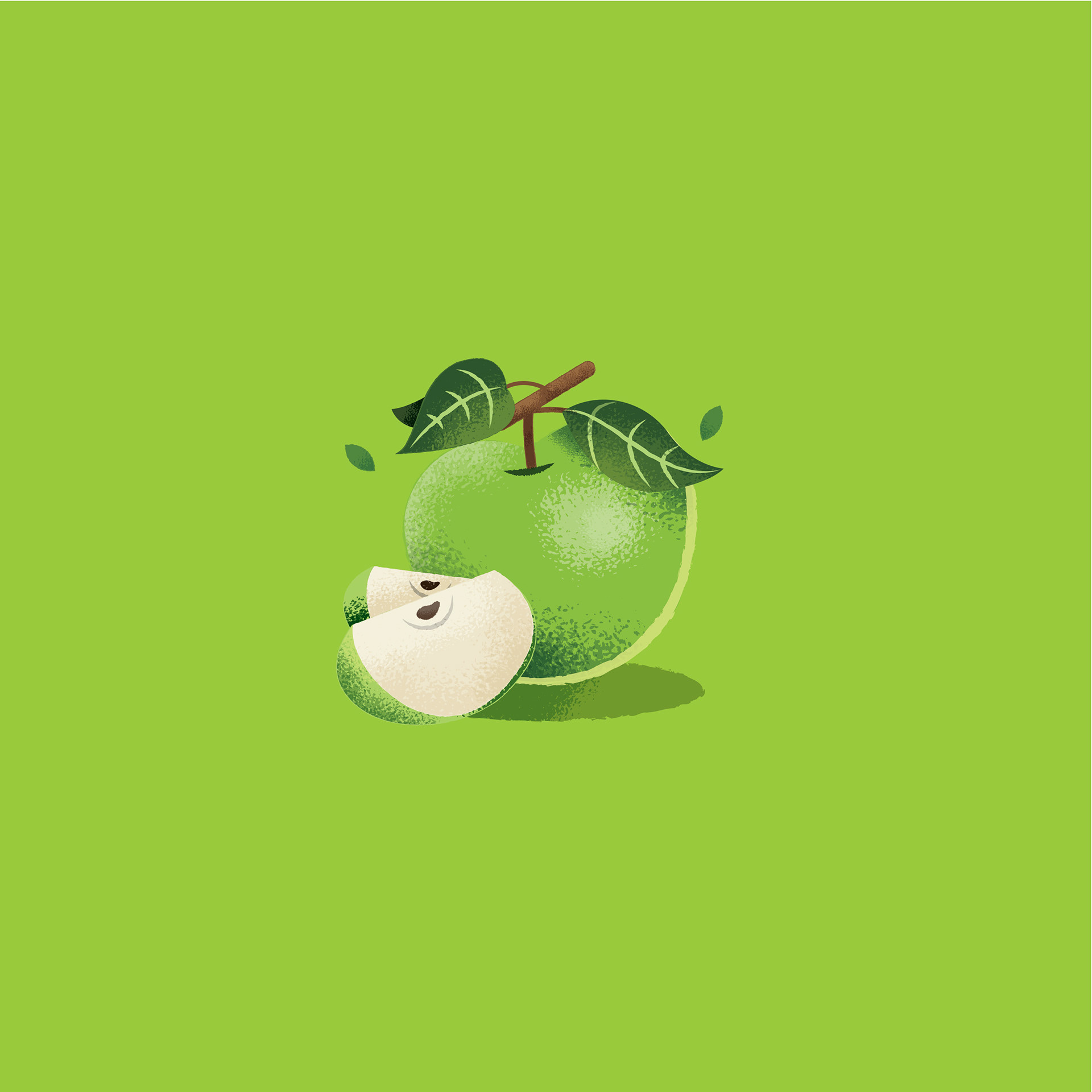
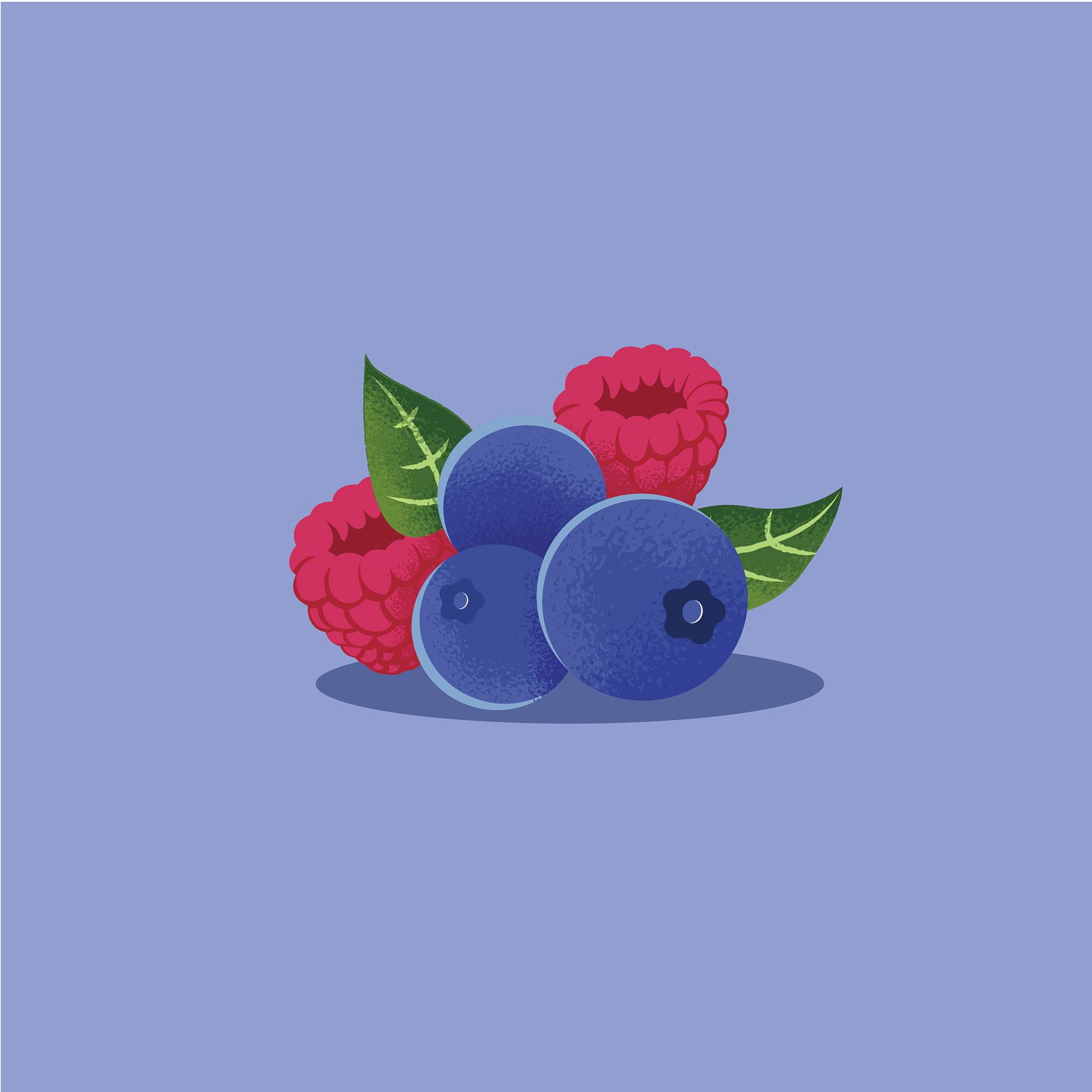



The new design successfully delivers a vibrant, eye-catching look that highlights the uniqueness of each fruit blend while maintaining a consistent and identifiable brand presence. The use of bold colors, dynamic illustrations, and clean typography ensures that Growers' sparkling water stands out on the shelf, attracting health-conscious consumers who value both aesthetics and quality.
This project not only met the client’s expectations but also set a new standard for vibrant, cohesive branding in the sparkling water market.
Shawn Mendis:
''Lucas illustrations are amazing, and made my brand look modern and fresh standing out from all my competitors!''

